Chinese Calligraphy
Chinese calligraphy is deliberate and distinct. It literally means “beautiful handwriting” (AsiaSociety.org). How and what a calligrapher writes is important to the craft. In ancient times, calligraphy was an art reserved for scholars, but contemporary Chinese artists today revitalize an ancient practice in the modern day. An important age for calligraphy was the 4th century when the Kaishu style was formed. This style is popular, flexible, and still relevant today (ChinaArtLover.com). Wang Xizhi greatly influenced the Kaishu style by developing the running script, which allowed an artist to form characters without lifting the brush. Calligraphy evokes smooth motion and mimics the workings of nature (AsiaSociety.org).
Wang Dongling 王冬龄:
TANG Xianzu, ‘Peony Pavilion: Introduction of the Thrush’, Entangled Script, 2017

This is Peony Pavilion: Introduction of the Thrush from Entangled Script by Wang Dongling 王冬龄. It is ink on paper, and it was created in 2017. The artist currently works in Hangzhou, China, so I think he probably created this in that location; he is a professor at the China Academy of Art (Ocula.com). Wang is a prominent modern Chinese calligrapher, he experiments with movements of his entire body, extending the relationship between art and the body that is so important to traditional calligraphy (Artsy.net).
The most important elements of calligraphy are line and form. Notice how the thickness and length of strokes varies throughout this piece. Some characters are more scrunched together while some are more stretched out. The variation in size and thickness of each character evokes an understanding of the relationship between the artist and the piece. Surely the artist made many careful and deliberate movements throughout the painting. Notice the lack of drops and splatters, the characters have a tendency to run together smoothly. There is one major area of open space on the left side of the painting. It is larger and circular toward the bottom and thinner and rectangular toward the top. There are two other splashes of free space above and to the right of the circular area.
I have taken a year of Mandarin, and while these characters are difficult for me to read, I can make out a few. The most clear characters to me are 乃 (nǎi) and 开 (kāi). 乃 means to be, so, only, or then. 开 means to open, to start, or to drive. The space 开 takes up is greater than many of the other characters used, and I think that emphasizes the openness of the character. 乃 is another of the larger characters used. I think the size and greater clarity of these two characters is to draw the viewer’s attention. For some reason, the artist chose to make these characters focal points. I think Mandarin is a beautiful language, and I enjoy memorizing characters. Practicing memorizing characters makes me feel very calm, and I feel that peace in this work.
Xu Bing:
Gravitational Arena
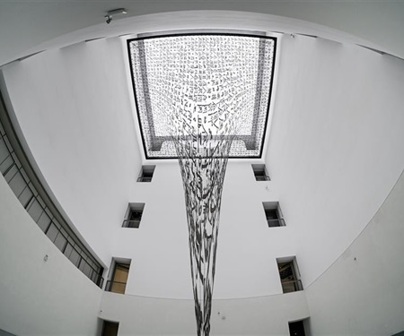

This is Xu Bing’s Gravitational Arena. It is a massive mixed media installation art piece developed and exhibited 2021-2022 in the Exhibition Hall X of Museum of Art Pudong (MAP) (MuseumofArtPD.org). This art installation plays with the eye and puzzles the viewers. The elongated characters are essentially illegible.
This piece is one of a massive size. Notice how it spans the height of several stories. The characters look so delicate the way they are put together and strung up. The consistent size of the characters at the very top level becomes extremely elongated and distorted throughout the rest of the piece. The thick black lines of calligraphy evoke a sense of traditional calligraphy. I like how the characters aren’t the typical ink on paper, yet they still have thicker points at the end of strokes. Chinese characters are written with specific stroke order, and the thicker section at the end of each stroke indicates the direction. Another important element of this piece is the wormhole model shape it takes. I like that this work directly ties gravity and language together. Language is powerful, impactful, and broad, so that is something I take away from this piece. Another major element of this work is dimension. The characters themself are flat and 2-dimensional, but they build a 3-dimensional structure. The contorting letters are difficult to read, evoking a sense of vastness. It’s like having a conversation without words. It makes my own feelings toward deliberate language bubble up to the surface. I like that this work makes me feel thoughtful.
There is also an inevitableness to this structure. Every character involved in the wormhole, while they are fixed in place, is understood as being a part of the wormhole. Whether or not they are entirely distorted yet doesn’t matter because there is an impending sense that they will be. Every element will be implicated in this chaotic vortex. Imagine looking at this piece through any of the different floors, and how the characters will run together with those behind it. This piece as whole intertwines language as a tool of people with a powerful natural force. It is a contemporary twist on traditional calligraphy.
Gu Gan: Life Always Exists Even in Freezing Forest, 2000
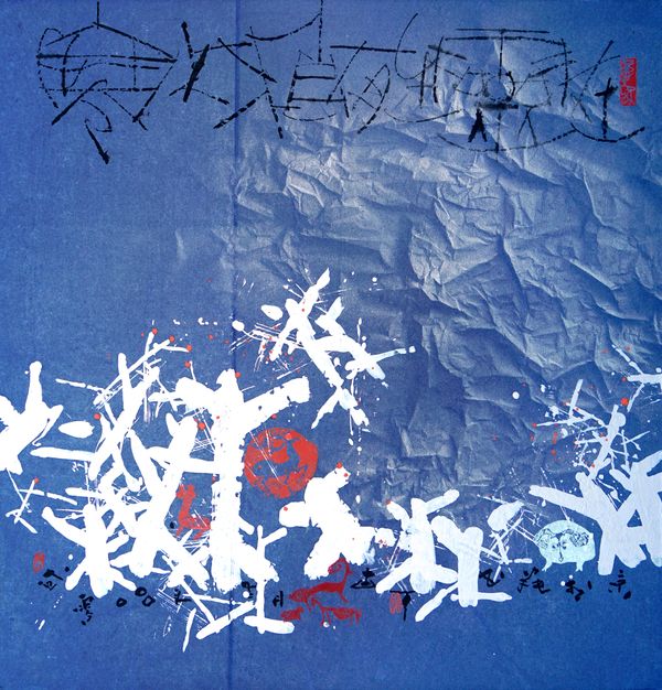
This is Gu Gan’s Life Always Exists Even in Freezing Forest. It is ink and color on rice paper, and it was created in 2000 (Ocula.com). He lives in Beijing and has had exhibitions there since 1985. Considering his past exhibitions and his current position as Chairman of the Association of Chinese Modern Painters and Calligraphers there, I think he probably created this in Beijing.
The fragility of rice paper is something that strikes me in this. The crinkling of the paper is present only in the upper diagonal portion; this is evidence that it is deliberate. The word “freezing” being in the title and the crinkled portion remind me of the brittleness of a thin layer of ice. I think that is why the paper is crinkled the way it is. Additionally, the use of white and red alongside the traditional black ink used in calligraphy is significant. White is a color associated with snow, purity, and life. The scattering of the white characters is reminiscent of snow-laden branches or snowflakes. The red color has the outline of an animal in it. I believe it’s a deer. Red itself is a color associated with life, and it depicts a living creature. There are tiny characters in black drawn along the bottom of the white characters. They almost look like splashes of ink because of how small they are, but I think I can make them out. The black characters along the top are different from the bottom portion. They are thin and splotchy. I feel like the artist's utensil may have been very light on the paper for these characters or even hovering over it. There is a coldness set by the dark blue of the paper, the striking white contrast, and the thinness of the top characters. It all reminds me of the nature of thick ice. Brittle at the top and heavy at the bottom.
Bibliography
“Asama // The American Sport Art Museum & Archives.” ASAMA The American Sport Art Museum Archives, https://www.asama.org/awards-of-sport/medallion-series/sport-artist-of-the-year/gu-gan/.
ChinaArtlover, written by. “What Is Chinese Modern Calligraphy?” China Artlover, 5 Feb. 2022, https://www.chinaartlover.com/what-is-chinese-modern-calligraphy.
“Chinese Calligraphy.” Asia Society, https://asiasociety.org/education/chinese-calligraphy.
Editorial, Artsy. “Gu Gan's Pioneering, Modernist Take on Traditional Chinese Calligraphy.” Artsy, 24 Nov. 2014, https://www.artsy.net/article/editorial-gu-gans-pioneering-modernist-take-on-traditional.
“Gu Gan Biography, Artworks & Exhibitions.” Ocula the Best in Contemporary Art Icon., https://ocula.com/artists/gu-gan/.
Guest, Luise. “Calligraphy in Contemporary Chinese Art.” Culture Trip, The Culture Trip, 2 Sept. 2013, https://theculturetrip.com/asia/china/articles/the-power-of-the-word-calligraphy-in-contemporary-chinese-art/.
“Mouton Rothschild 1996 - Gu Gan.” Chteau Mouton Rothschild, https://www.chateau-mouton-rothschild.com/label-art/discover-the-artwork/gu-gan.
Museum of Art Pudong, https://www.museumofartpd.org.cn/en/exhibitiondetail?id=92.
“The Project.” Write, https://writecalligraphyproject.eu/the-project/.
“Wang Dongling Biography, Artworks & Exhibitions.” Ocula the Best in Contemporary Art Icon., https://ocula.com/artists/wang-dongling/.
“Wang Dongling 王冬龄: Tang Xianzu, 'Peony Pavilion: Introduction of the Thrush', Entangled Script (2017): Available for Sale.” Artsy, https://www.artsy.net/artwork/wang-dongling-wang-dong-ling-tang-xianzu-peony-pavilion-introduction-of-the-thrush-entangled-script.
“Xu Bing: Gravitational Arena Made Its Debut at Museum of Art Pudong - Exhibitions - Art News - CAFA Art Info: Find Chinese Contemporary Art and News.” Xu Bing: Gravitational Arena Made Its Debut at Museum of Art Pudong - Exhibitions - Art News - CAFA ART INFO | Find Chinese Contemporary Art and News, https://www.cafa.com.cn/en/news/details/8331548.
The focus on the rice paper as a metaphor for thin ice also sticks out to me. I would argue that the rice paper and thin layer of ice is almost a warning for future people passing by not to walk over it. Fragility is in the eye of the beholder and how they may heed warnings. Snowy and icy landscapes are beautiful to look at, however there needs to be a degree of caution when walking around it as it can create a devastating event if you fall through thin layers of ice. The black splotches on the bottom make me think of those who did not heed the warning and were forgotten about beneath the ice. There are so many things that can be hidden under ice that are typically not discovered until it is thawed out. Many people go missing during the winter because of how far they may fall through ice. This is what came to mind when I look at this piece and think of how icy landscapes creates tragedies.
ReplyDeleteI love your additional thoughts on this! That's an engaging perspective. I'm glad it struck something in you.
DeleteGreat job this week! I too focused on Chinese art but chose the landscape ink and water style of art. I've always enjoyed the almost majestic if not historic look those types of paintings give. Chinese calligraphy has also been a huge interest of mine, as they take such care in the details behind their symbols and their meanings. Rice paper must have been a staple for their artist, and probably still is, as the landscape art, I focused my blog exhibit on was also conducted on rice paper. The Ink may react in a different way on this paper than it would on other materials. I enjoyed the level of detail and background information you provided for each of your pieces, congrats on the last post of this class!
ReplyDeleteJasmine
Hi Alyssa! I love that you chose to do Chinese calligraphy. I never really considered it art, but seeing it displayed in such a way for the three artworks that you chose I have learned that there is more to it than I originally thought. I like how unique each one is. Just as your first statement says, you can see how deliberate each one is. I think the first one by Wang Dongling is my favorite even though it seems to be the simplest. There is something about the way the bold lines decorate the brown page that seems intriguing. As far as color, to me I see five colors: black, red, gray, brown, and black. The frame adds to the art in making it nice and bold. The lines that are used are obviously thick, but the way that some characters are smaller and squeezed together in some places, while in others they are larger and more spaced out reminds me of abstract art. I don’t know what’s going on in this piece, but I love it and I’m not even quite sure as to why. I think it’s the fact that if I were to try to do something like this, it definitely would not come out appealing in any way. Oh, but it might be my love for graffiti! The lines remind me of street art and I dig it!
ReplyDelete